Location
Worldwide
Availability
2 open slots
Experience
52 stores designed
Specialization
E-commerce design
Belluna
Product page redesign for a brand selling wireless comfort bras and shapewear
Customer & Competitive Research
UX Copy
Visual Direction
Custom AI Imagery
Fully Responsive Design
Design System
Developer Handoff
The brand
Belluna sells wireless comfort bras and shapewear in Germany, Austria and the UK. The range is small, so most of the business runs through one product page.
The problem
Before any design work I ran customer research across the category. Two thirds of returns here come down to size. Every return costs the brand around 30 euros to handle, and less than half of returned stock sells again at full price.
The page Belluna was running left the size choice to the shopper. There was a size chart and a dropdown, and nothing else to help. Some people guess and get the size wrong, others order two sizes so they can send one back, and plenty leave the page without buying anything.
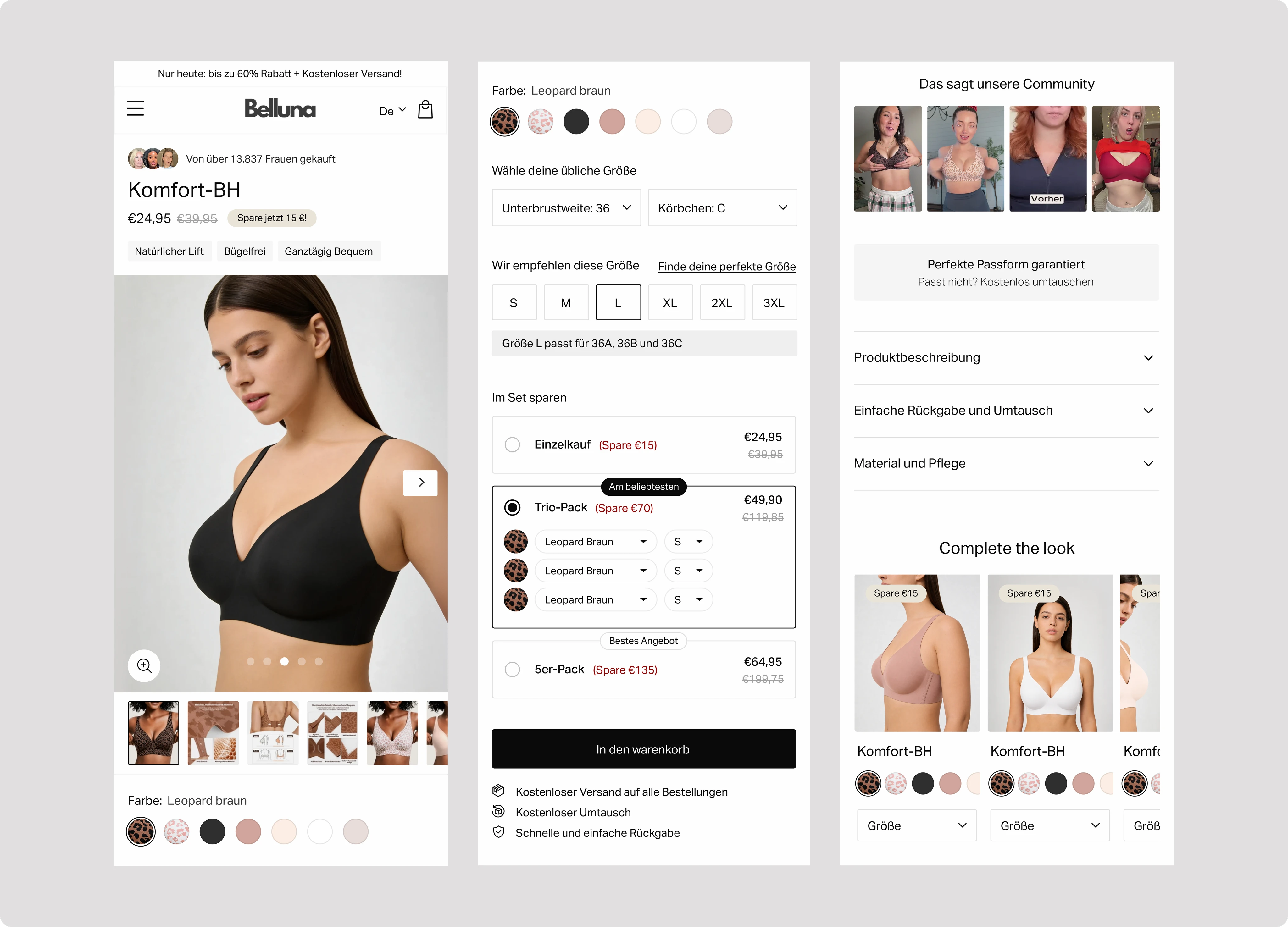
A buy box built to remove the size objection
Most returns start at the size selector, so the dropdown is gone and every size is visible on the page. A fit calculator turns the measurements a shopper already knows into the right size in Belluna's range. The fit guarantee sits under the add to cart button instead of inside a policy page.
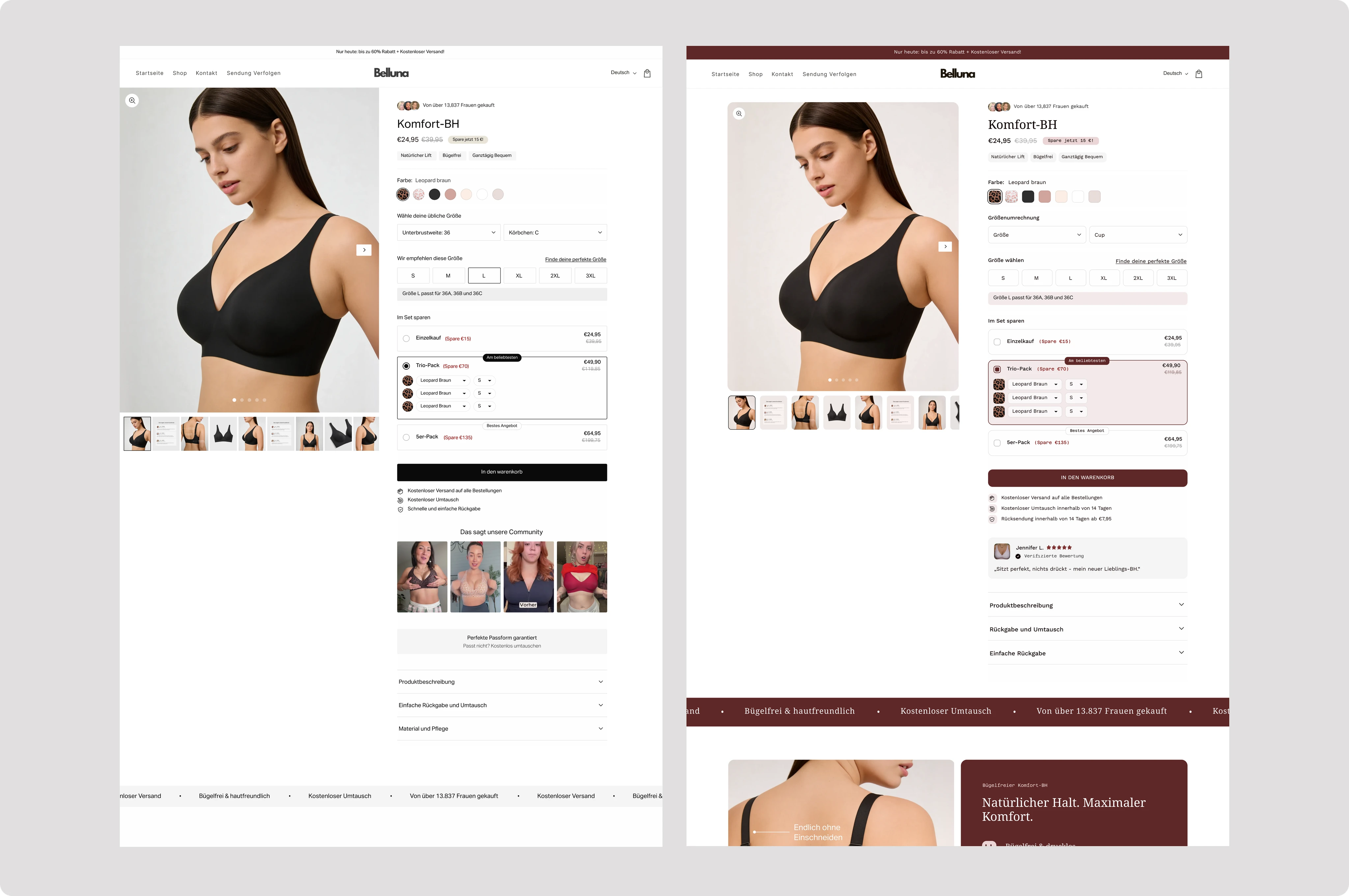
Two complete visual concepts
Both were finished pages rather than colour variations, so Belluna could judge two genuinely different expressions of the brand against real hierarchy and real content instead of a mood board.
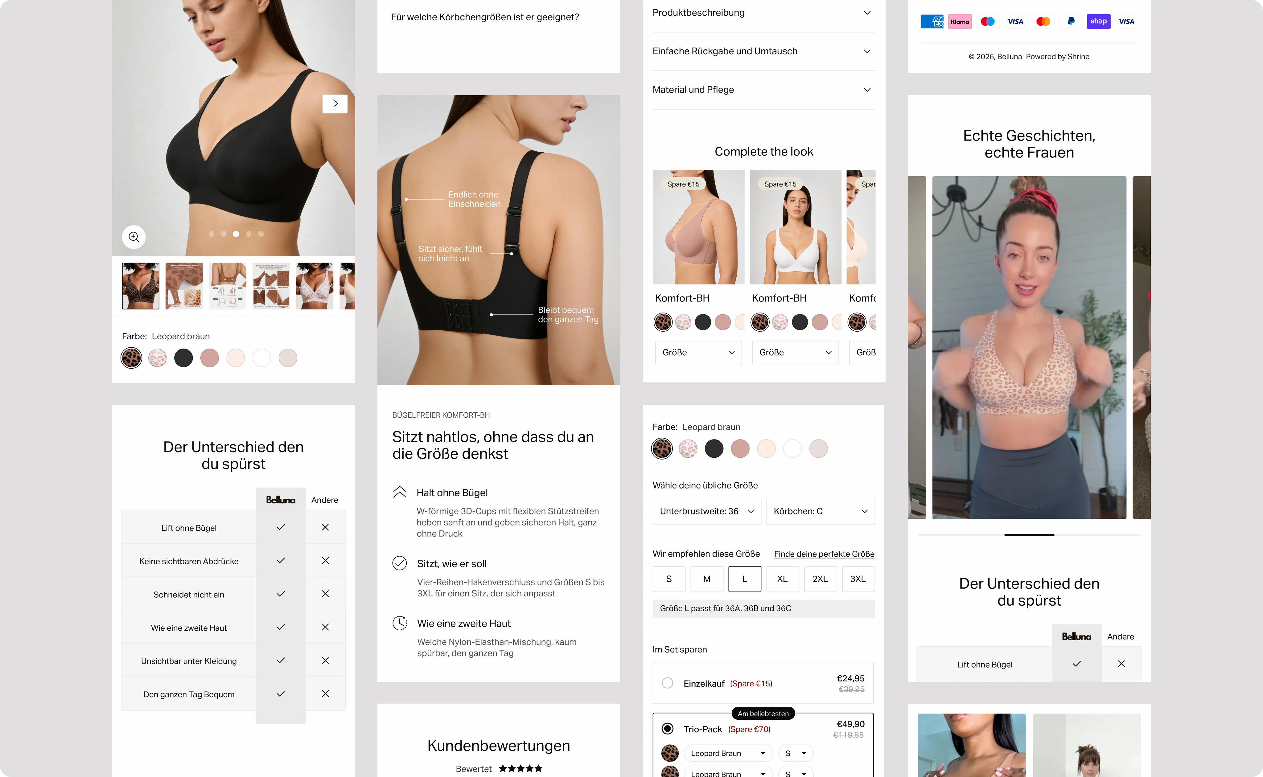
Product imagery that supports the price
The old gallery made the product look cheaper than it is. It sat at the top of the page, next to the buy button, where everyone sees it first. I created a new set of product images showing what people check before they buy, including the fit and how it looks under clothing. There was no photoshoot to pay for, and Belluna now has a full image library for every product it sells.

Built to bring the returns down
Most product page redesigns are judged on how much better the page looks. This one was built around the one thing that costs this brand the most money.
Belluna
Product page redesign for a DTC brand selling wireless comfort bras and shapewear
Customer & Competitive Research
Custom AI Imagery
Visual Direction
UX Copy
Fully Responsive Design
Design System
Developer Handoff
Belluna
Product page redesign for a brand selling wireless comfort bras and shapewear
UX Copy
Customer & Competitive Research
Visual Direction
Custom AI Imagery
Fully Responsive Design
Design System
Developer Handoff
The brand
Belluna sells wireless comfort bras and shapewear in Germany, Austria and the UK. The range is small, so most of the business runs through one product page.
The problem
Before any design work I ran customer research across the category. Two thirds of returns here come down to size. Every return costs the brand around 30 euros to handle, and less than half of returned stock sells again at full price.
The page Belluna was running left the size choice to the shopper. There was a size chart and a dropdown, and nothing else to help. Some people guess and get the size wrong, others order two sizes so they can send one back, and plenty leave the page without buying anything.
The approach
Before any design work started I ran customer research across the category, covering what drives the purchase decision for comfort bras online, where shoppers hesitate, and which factors most reliably lead to a return.
I then went through the leading brands in detail, both where their product pages work and where they leave opportunities open. Several of the strongest features on the redesigned page came out of finding a competitor's idea and rebuilding it to work better than the original.
A buy box built to remove the size objection
Most returns start at the size selector, so the dropdown is gone and every size is visible on the page. A fit calculator turns the measurements a shopper already knows into the right size in Belluna's range. The fit guarantee sits under the add to cart button instead of inside a policy page.
Two complete visual concepts
Both were finished pages rather than colour variations, so Belluna could judge two genuinely different expressions of the brand against real hierarchy and real content instead of a mood board.
Product imagery that supports the price
The old gallery made the product look cheaper than it is. It sat at the top of the page, next to the buy button, where everyone sees it first. I created a new set of product images showing what people check before they buy, including the fit and how it looks under clothing. There was no photoshoot to pay for, and Belluna now has a full image library for every product it sells.
Built to bring the returns down
Most product page redesigns are judged on how much better the page looks. This one was built around the one thing that costs this brand the most money.
Booking for September
Let's talk about your store
A short call to find what's costing you sales, and what I'd change
Let’s talk about your store
Prefer email?
tan@wayrise.studio
Let’s talk about your store
Prefer email?
tan@wayrise.studio